Ordinary Least Squares Linear Regression
Ordinary linear least squares regression is one of the first statistical methods that anyone learns who is trying to understand how two sets of numbers relate. It has an undeserved reputation of being able to foretell the future, but it is mathematically tractable, simple to apply, and often yields either directly usable results or signals the need for more sophisticated tools.
The idea is simple enough, find the line that passes through points in Cartesian (x,y 2-dimensional space) that minimizes the total distance (another over-simplification) between each point and the line. In slightly informal terms
\[y = mx + b\]
where y is the dependent variable, x is the independent variable, m is the correlation coefficient, or slope and b is the intercept, the value at which the slope intersects the y axis.
This neglects the term \[\epsilon\] arising from measurement error, random variation or both. I’ll set that aside for this discussion.
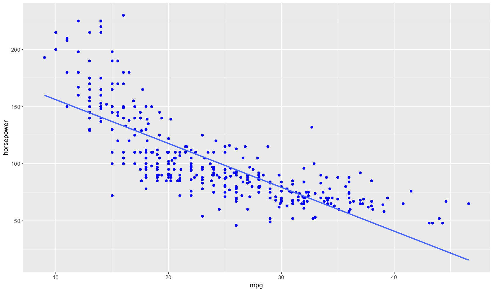
A regression, such as miles per gallon against horsepower, may give you plot of the paired point values (x,y) something like the following, indicating a trend.
| Estimate | Std. Error | t value | Pr(>|t|) | |
|---|---|---|---|---|
| (Intercept) | 39.94 | 0.7175 | 55.66 | 1.22e-187 |
| horsepower | -0.1578 | 0.006446 | -24.49 | 7.032e-81 |
| Observations | Residual Std. Error | \(R^2\) | Adjusted \(R^2\) |
|---|---|---|---|
| 392 | 4.906 | 0.6059 | 0.6049 |
Even better, the model summary indicates a high coefficient of correlation, R2, with a p-value (the unfortunately named “significance”) that is vanishingly small, and so unlikely due to chance.
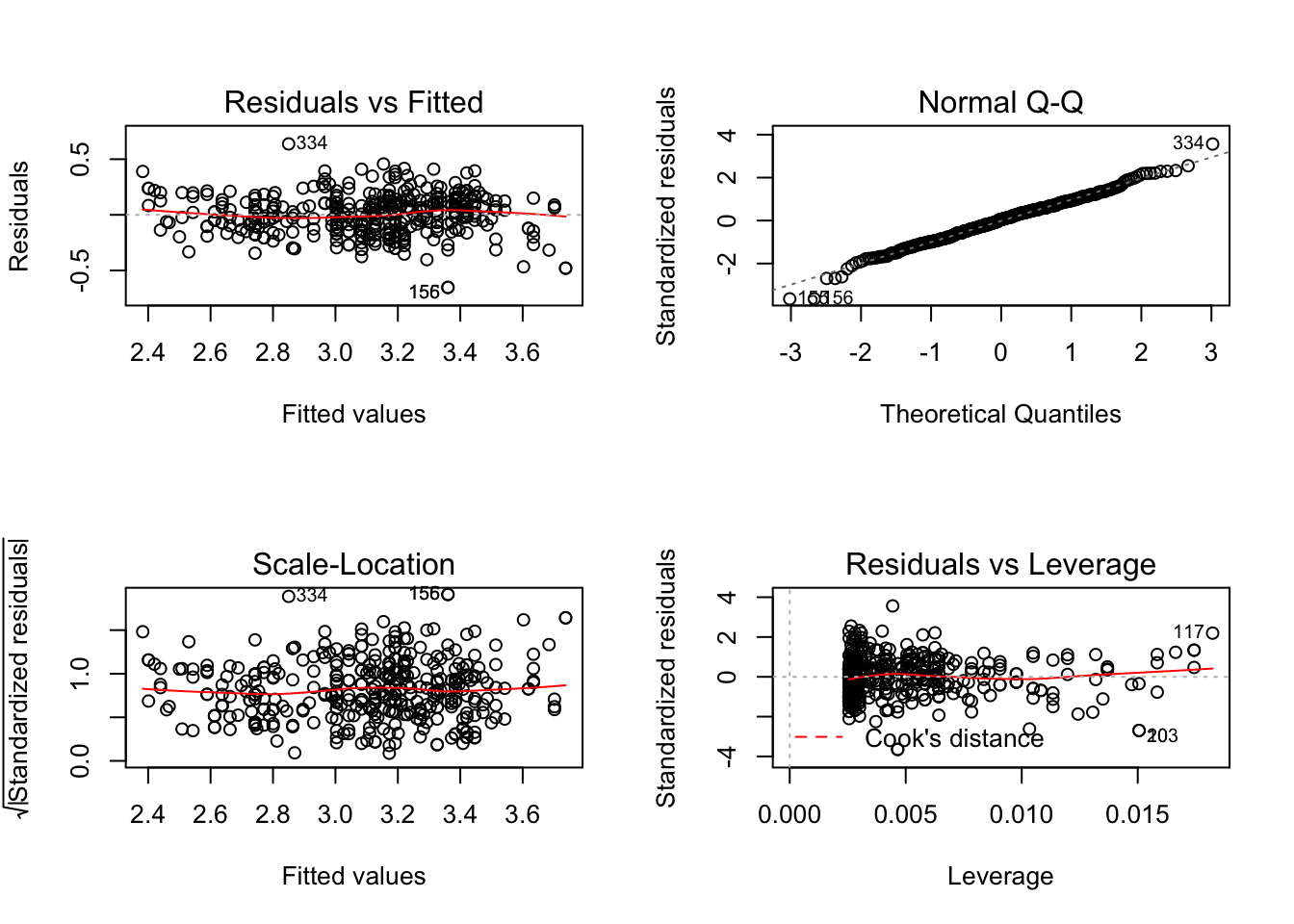
In another post, I’ve discussed interpreting the model summary, but I haven’t mentioned the graphical methods that are a critical part of understanding what the data are telling you.
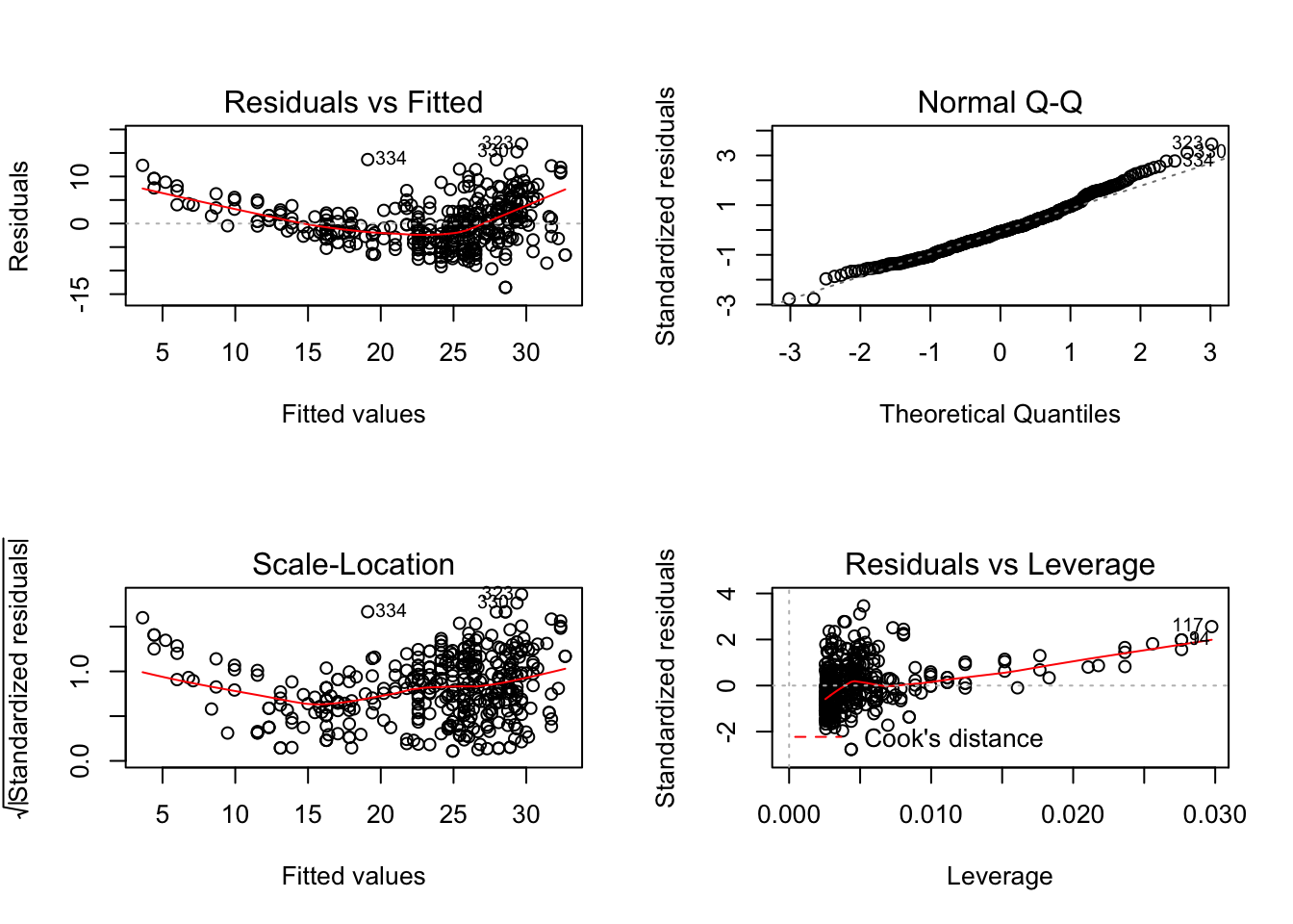
Ideally, in the two plots on the left hand side, we would like to see points clustered along the centerline. On the upper right, we would like to see most of the points – the residuals obtained from the distance of a point pair from the dashed line that represents a normal distirubtion – line up. On the lower right, we don’t want to see a curve being “pulled up” by far off outliers.1
The departures from the ideal are easy enough to spot. What to do about them? Let’s look at the initial data again, this time without the trend line.
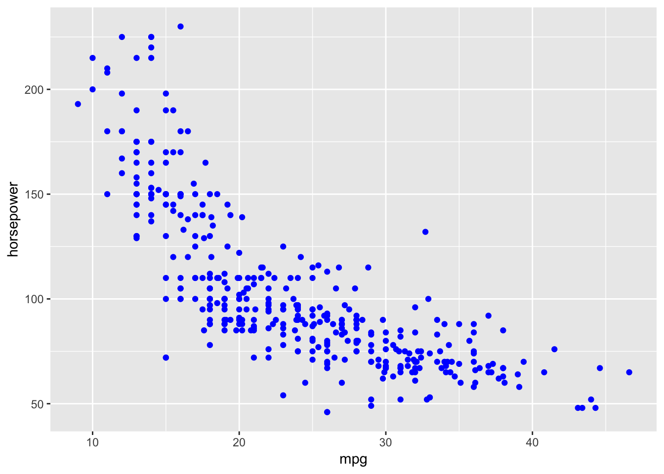
How would you draw a line by hand through the points? Would it be two straight lines? A decay curve?
Sometimes, we can improve fit through transforming the scale of one or both variables. A commonly used transformation is to express one variable as a natural logarithm (which is the default in R; other bases are available, such as decimal – log10()). For this dataset a log-log transformation has a slight advantage.
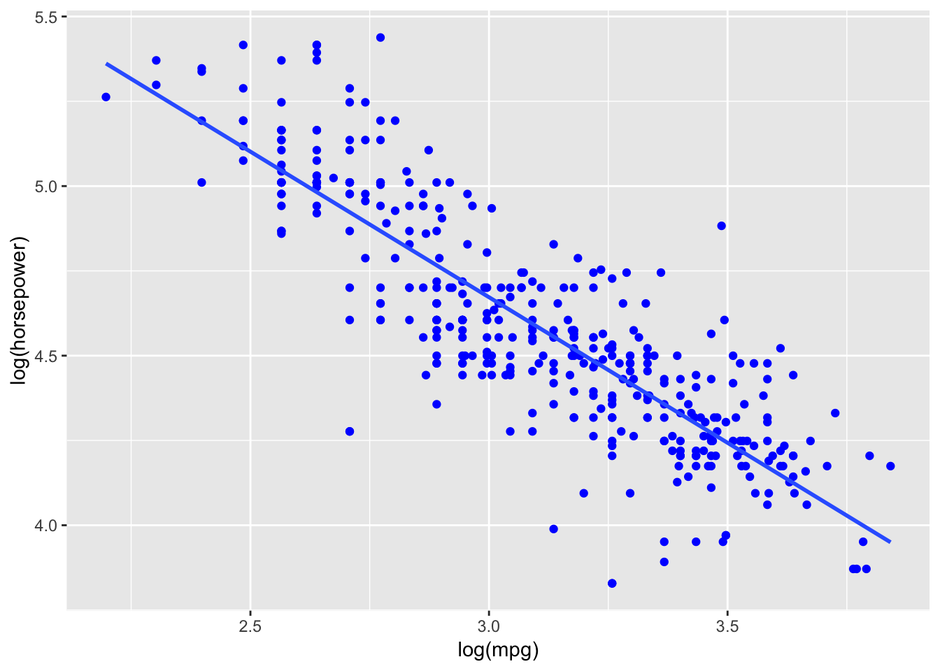
This results in an improvement of R2 and a large decrease in the standard error. The plots show minimal non-linearity, the residuals are now very close to being normally distributed, and outliers show negligible effect.
| Estimate | Std. Error | t value | Pr(>|t|) | |
|---|---|---|---|---|
| (Intercept) | 6.961 | 0.1215 | 57.3 | 5.168e-192 |
| log(horsepower) | -0.8418 | 0.02641 | -31.88 | 1.128e-110 |
| Observations | Residual Std. Error | \(R^2\) | Adjusted \(R^2\) |
|---|---|---|---|
| 392 | 0.1793 | 0.7227 | 0.722 |
Sometimes it’s not even this subtle
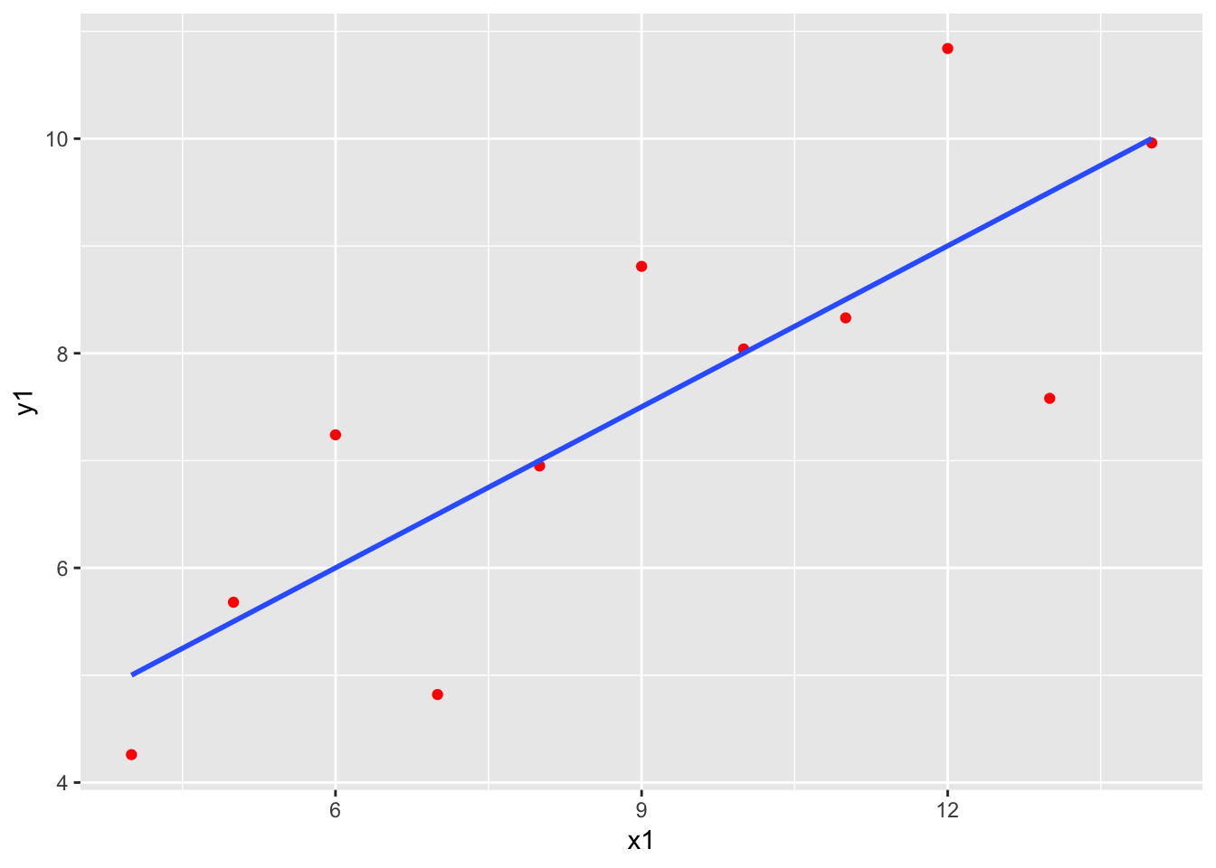
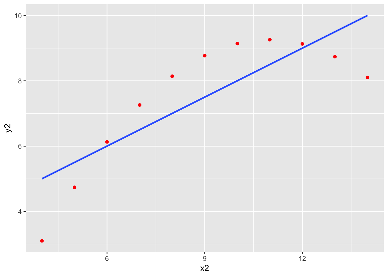
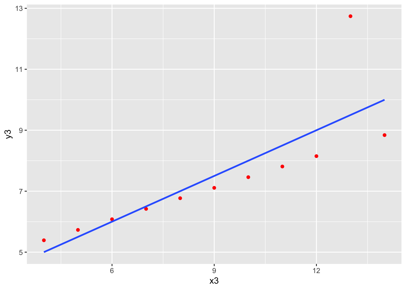
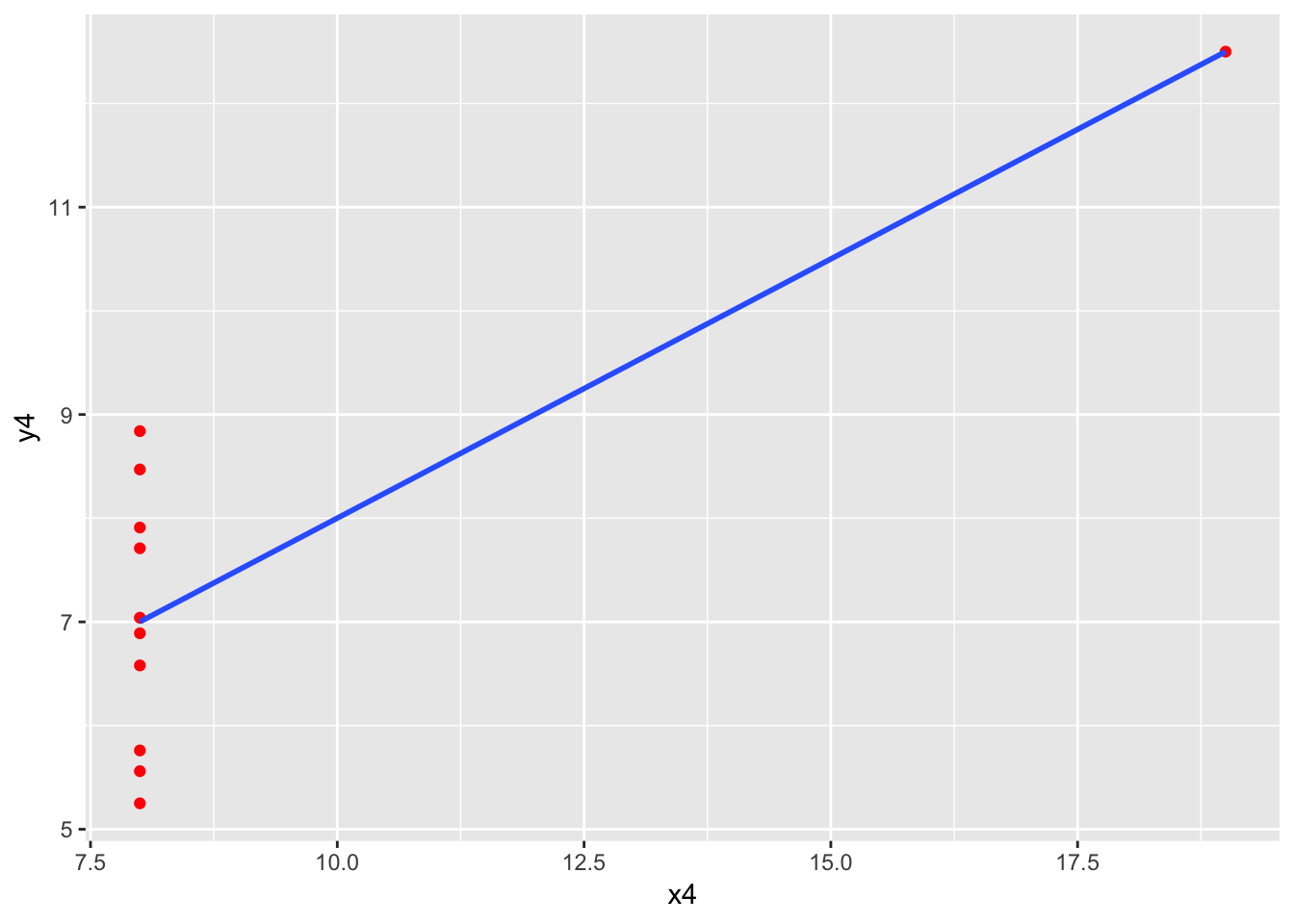
Here is the famous, contrived “anscombe” dataset that shows why plotting should be the first step in any linear regression. There are four datasets and four models, with practically identical output.
| Estimate | Std. Error | t value | Pr(>|t|) | |
|---|---|---|---|---|
| (Intercept) | 3 | 1.125 | 2.667 | 0.02573 |
| x1 | 0.5001 | 0.1179 | 4.241 | 0.00217 |
| Observations | Residual Std. Error | \(R^2\) | Adjusted \(R^2\) |
|---|---|---|---|
| 11 | 1.237 | 0.6665 | 0.6295 |
| Estimate | Std. Error | t value | Pr(>|t|) | |
|---|---|---|---|---|
| (Intercept) | 3.001 | 1.125 | 2.667 | 0.02576 |
| x2 | 0.5 | 0.118 | 4.239 | 0.002179 |
| Observations | Residual Std. Error | \(R^2\) | Adjusted \(R^2\) |
|---|---|---|---|
| 11 | 1.237 | 0.6662 | 0.6292 |
| Estimate | Std. Error | t value | Pr(>|t|) | |
|---|---|---|---|---|
| (Intercept) | 3.002 | 1.124 | 2.67 | 0.02562 |
| x3 | 0.4997 | 0.1179 | 4.239 | 0.002176 |
| Observations | Residual Std. Error | \(R^2\) | Adjusted \(R^2\) |
|---|---|---|---|
| 11 | 1.236 | 0.6663 | 0.6292 |
| Estimate | Std. Error | t value | Pr(>|t|) | |
|---|---|---|---|---|
| (Intercept) | 3.002 | 1.124 | 2.671 | 0.02559 |
| x4 | 0.4999 | 0.1178 | 4.243 | 0.002165 |
| Observations | Residual Std. Error | \(R^2\) | Adjusted \(R^2\) |
|---|---|---|---|
| 11 | 1.236 | 0.6667 | 0.6297 |
Looking before you leap:
Credits
Software (R Development Core Team (2008). R: A language and environment for statistical computing. R Foundation for Statistical Computing, Vienna, Austria. ISBN 3-900051-07-0, URL http://www.R-project.org.)
data Auto dataset from Gareth James, Daniela Witten, Trevor Hastie and Rob Tibshirani (2017). ISLR: Data for an Introduction to Statistical Learning with Applications in R. R package version 1.2. https://CRAN.R-project.org/package=ISLR; contrived data from Anscombe, Francis J. (1973). Graphs in statistical analysis. The American Statistician, 27, 17–21. doi: 10.2307/2682899, an included dataset in R.
trendline plot H. Wickham. ggplot2: Elegant Graphics for Data Analysis. Springer-Verlag New York, 2016.
formating of linear regression summary Gergely Daróczi and Roman Tsegelskyi (2018). pander: An R ‘Pandoc’ Writer. R packageversion 0.6.2. https://CRAN.R-project.org/package=pander
The technical explanation of the plots I’ve save for another post.↩︎